I'm currently working on a public release of a tool I wrote a while ago for generating VS 2010 Bdc Models from a DLL which exposes Web Service (WCF/ASMX) reference or other API calls. The original version was written using Winforms .Net 3.5 and the new version is WPF .Net 4 and I'm currently re-jigging the code to use a nice MVVM pattern rather than doing a re-hash of the original!
I originally wrote this application because the SharePoint designer BDC functionality could not handle complex web services with deep return and parameter objects such as requests and responses with container objects and we wanted a way of easily integrating web services in a consistent manner without having to manually produce VS BDC models.
The app has a nice UI which reflects the target DLL and allows the user to pick an entity then the CRUD methods required for the model. C# and BDCM XML is generated for the entity, BDCM and service classes which are written to a package.
A template will be provided shortly after the application release.
Thursday, 24 March 2011

Thursday, 17 February 2011
SharePoint 2010 Silverlight Web Part JavaScript Bridge
SharePoint 2010 Silverlight Web Part JavaScript Bridge



Overview
This template contains base classes and scripts enabling Silverlight web parts (and ASP.Net web parts) to be created enabling client-side interaction with other Silverlight Web Parts. A JavaScript file is injected into the page automatically and allows Web Parts to register themselves for interaction with the bridge. If only Silverlight to Silverlight communication is required, local messaging could be used as an alternative mechanism, however this technique allows interaction from both Silverlight and ASP.Net web parts which is more flexible for SharePoint applications. A Web Part using the base classes has the following properties required for JS Bridge connection:
- JSClientID - Used to pass the JavaScript Bridge ClientID from the SharePoint UI to the Web Part. JSClientID is a simple identifier for components connecting to the JS Bridge.
- JSClientSourceID - Used to pass the JavaScript Bridge ClientSourceID from the SharePoint UI to the Web Part. JSClientSourceID indicates to the JS Bridge where a components connection is sourced.
- JSUniqueClientID - JSClientSourceID indicates to the JS Bridge the real ID of the component on the page. It is derived from the WebParts’s ClientID with an ‘SL’ suffix.

Registering Clients
When a JS Bridge Web Part loads, it registers itself with the JS Bridge using the registerClient method, this allows the bridge to locate the WebPart on the page and lets it know where to route data.

Installing
The package can be deployed straight to a local SharePoint 2010 server from Visual Studio 2010. The feature should appear in the default site collection features list:

Testing
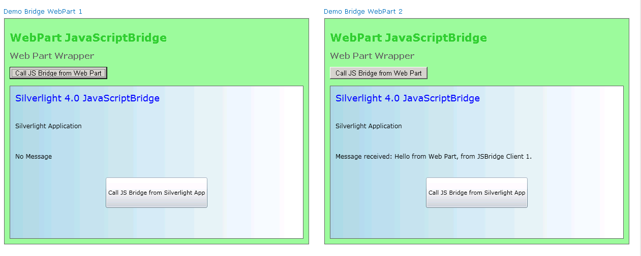
To test the functionality, simply place 2 instances of the demo web part on a page. The demo web part is designed so one instance can talk to another instance of itself but normally different web parts would talk to each other.

The first web part can be configured as follows:

The second web part can be configured as follows:

Using the Silverlight UserControlBase Class
Obviously the contents of the base class can be copied to a user control, but to implement it as a base for a user control the following steps must be taken:
Application Manifest
The ‘ExternalCallersFromCrossDomain’ attribute must be set to ‘ScriptableOnly’ to allow applications hosted on a different site to the SharePoint site (cross-domain) to access the DOM; otherwise the JSBridge will not work. This can be a security risk particularly for public facing sites, so it's best to host the XAP in SharePoint.
<Deployment xmlns="http://schemas.microsoft.com/client/2007/deployment" xmlns:x="http://schemas.microsoft.com/winfx/2006/xaml" ExternalCallersFromCrossDomain="ScriptableOnly" > <Deployment.Parts> </Deployment.Parts> </Deployment> |
AssemblyInfo
The following attribute must be included in the AssemblyInfo file so that the UserControlBase can be implemented. The ‘System.Windows.Markup’ namespace needs referencing for this.
The following attribute must be included in the AssemblyInfo file so that the UserControlBase can be implemented. The ‘System.Windows.Markup’ namespace needs referencing for this.
[assembly: XmlnsDefinition("http://schemas.microsoft.com/winfx/2006/xaml/presentation", "WebberCross.JavaScriptBridge.SilverlightApplication11")] |
Calling JSBridgeSend
The example shows how an object can easily be JSON serialized then sent to the JS Bridge where it will be multi-cast to all registered web parts with a matching JavaScriptClintSourceID
// Send a message to the bridge DemoMessage msg = new DemoMessage("Hello from Silverlight Application", base._jsClientID.ToString()); string jsonMsg = JSONHelper.Serialize(msg); base.JSBridgeSend(jsonMsg); |
Overriding JSBridgeReceive
The example shows how to override the 'JSBridgeReceive' method to deserialize the sent object:
// Override base JSBridgeReceive method public override void JSBridgeReceive(string arg) { try { // Deserialize message DemoMessage msg = JSONHelper.Deserialize<DemoMessage>(arg); // Write message to label this.lbl3.Text = string.Format("{0}, from JSBridge Client {1}", msg.Message, msg.JSClientID); } catch (Exception ex) { MessageBox.Show(ex.ToString()); } } |
Conclusion
The JavaScript Bridge is a great way of enabling Silverlight web parts to interact with each other in the browser, it also allows Silverlight web parts to be communicated with from a web page. The base classes provide a quick way of getting standard behavior in sets of web parts.
Sunday, 13 February 2011


Wednesday, 9 February 2011
Silverlight 4 Toolkit Chart Zoom and Pan Extension
Silverlight 4 Toolkit Chart Zoom and Pan Extension
 | |
 |  |
Features
- Utilises existing toolkit without modification
- Zoom box functionality
- Mouse wheel zoom functionality
- Pan functionality
- Scroll Functionality
- X Span functionality
Overview
I've been working on a project which uses the Silverlight 4 Toolkit chart control. The control is great, however there is no real zoom functionality which is a problem.Here is an example given where the charts template is moidified to provide a ScrollViewer wrapper for the chart panel which allows you to zoom the whole chart and scroll around it:
http://www.silverlight.net/content/samples/sl4/toolkitcontrolsamples/run/default.html
[DataVisualization -> Zoom]
The big problem with this is that the axes are scrolled with the chart surface, which is not the desired effect.
Solution
I thought about this for a while and came up with a solution without modifying the source.
It was clear that the problem stemmed from the fact that the axes were not independent of the plot surface, but this could be easily solved by using a grid with 3 plot surfaces to hold the main plot surface and X and Y axes:

The scroll behaviour of the axes plot surfaces can be tied to the main plot surface to make it appear as though they were one piece!
Layout
Each panel requires a chart control and a customised template. The controls are added to the grid. The next step is to hide the axes on the main plot surface, this can't be done manipulating individual templates for each of the 3 chart areas and styling out the axis features:
<Style x:Key ="zoomChartMajorTickMarkStyle" TargetType="Line">
<Setter Property="Visibility" Value="Collapsed" />
</Style>
<Style x:Key ="zoomChartAxisLabelStyle" TargetType="chartingToolkit:AxisLabel">
<Setter Property="Visibility" Value="Collapsed" />
</Style>
<Style x:Key ="zoomChartHiddenPointStyle" TargetType="chartingToolkit:LineDataPoint">
<Setter Property="Visibility" Value="Collapsed" />
</Style>
<Setter Property="Visibility" Value="Collapsed" />
</Style>
<Style x:Key ="zoomChartAxisLabelStyle" TargetType="chartingToolkit:AxisLabel">
<Setter Property="Visibility" Value="Collapsed" />
</Style>
<Style x:Key ="zoomChartHiddenPointStyle" TargetType="chartingToolkit:LineDataPoint">
<Setter Property="Visibility" Value="Collapsed" />
</Style>
The x and y templates are then stripped down to leave just the main named surface and a ScrollViewer:
<ControlTemplate TargetType="chartingToolkit:Chart" x:Key="ZoomXTemplate">
<Border Background="{TemplateBinding Background}" BorderBrush="{TemplateBinding BorderBrush}" BorderThickness="{TemplateBinding BorderThickness}" Padding="0">
<Grid>
<ScrollViewer
x:Name="ChartScrollArea" BorderThickness="0"
HorizontalScrollBarVisibility="Visible" VerticalScrollBarVisibility="Hidden" LayoutUpdated="XScrollArea_LayoutUpdated">
<chartingPrimitivesToolkit:EdgePanel x:Name="ChartArea" Style="{TemplateBinding ChartAreaStyle}" />
</ScrollViewer>
</Grid>
</Border>
</ControlTemplate>
<Border Background="{TemplateBinding Background}" BorderBrush="{TemplateBinding BorderBrush}" BorderThickness="{TemplateBinding BorderThickness}" Padding="0">
<Grid>
<ScrollViewer
x:Name="ChartScrollArea" BorderThickness="0"
HorizontalScrollBarVisibility="Visible" VerticalScrollBarVisibility="Hidden" LayoutUpdated="XScrollArea_LayoutUpdated">
<chartingPrimitivesToolkit:EdgePanel x:Name="ChartArea" Style="{TemplateBinding ChartAreaStyle}" />
</ScrollViewer>
</Grid>
</Border>
</ControlTemplate>
The main chart template has a ScrollViewer, but also a canvas and a rectangle added for a zoom box:
<ControlTemplate TargetType="chartingToolkit:Chart" x:Key="ZoomChartTemplate">
<Border Background="{TemplateBinding Background}" BorderBrush="{TemplateBinding BorderBrush}"
BorderThickness="{TemplateBinding BorderThickness}" Padding="0">
<Grid>
<Canvas x:Name="ZoomCanvas" HorizontalAlignment="Stretch" VerticalAlignment="Stretch" Canvas.ZIndex="2">
<Rectangle x:Name="ZoomBox" Height="100" Width="100"
Canvas.ZIndex="2" Fill="#FFA3AEB9" Opacity="0.4" Visibility="Collapsed"
Canvas.Left="10" Canvas.Top="10">
</Rectangle>
</Canvas>
<ScrollViewer x:Name="ChartScrollArea" BorderThickness="0"
HorizontalScrollBarVisibility="Hidden" VerticalScrollBarVisibility="Hidden" MouseLeftButtonUp="ChartScrollArea_MouseLeftButtonUp" MouseLeftButtonDown="ChartScrollArea_MouseLeftButtonDown" Loaded="ChartScrollArea_Loaded" MouseMove="ChartScrollArea_MouseMove">
<chartingPrimitivesToolkit:EdgePanel x:Name="ChartArea" Style="{TemplateBinding ChartAreaStyle}">
<Grid Canvas.ZIndex="-1" Style="{TemplateBinding PlotAreaStyle}" />
<Border Canvas.ZIndex="1" BorderBrush="#FF919191" BorderThickness="1" />
</chartingPrimitivesToolkit:EdgePanel>
</ScrollViewer>
</Grid>
</Border>
</ControlTemplate>
<Border Background="{TemplateBinding Background}" BorderBrush="{TemplateBinding BorderBrush}"
BorderThickness="{TemplateBinding BorderThickness}" Padding="0">
<Grid>
<Canvas x:Name="ZoomCanvas" HorizontalAlignment="Stretch" VerticalAlignment="Stretch" Canvas.ZIndex="2">
<Rectangle x:Name="ZoomBox" Height="100" Width="100"
Canvas.ZIndex="2" Fill="#FFA3AEB9" Opacity="0.4" Visibility="Collapsed"
Canvas.Left="10" Canvas.Top="10">
</Rectangle>
</Canvas>
<ScrollViewer x:Name="ChartScrollArea" BorderThickness="0"
HorizontalScrollBarVisibility="Hidden" VerticalScrollBarVisibility="Hidden" MouseLeftButtonUp="ChartScrollArea_MouseLeftButtonUp" MouseLeftButtonDown="ChartScrollArea_MouseLeftButtonDown" Loaded="ChartScrollArea_Loaded" MouseMove="ChartScrollArea_MouseMove">
<chartingPrimitivesToolkit:EdgePanel x:Name="ChartArea" Style="{TemplateBinding ChartAreaStyle}">
<Grid Canvas.ZIndex="-1" Style="{TemplateBinding PlotAreaStyle}" />
<Border Canvas.ZIndex="1" BorderBrush="#FF919191" BorderThickness="1" />
</chartingPrimitivesToolkit:EdgePanel>
</ScrollViewer>
</Grid>
</Border>
</ControlTemplate>
Code
There is a lot of code for working out the zoom geometry (this took some time to work out, but works nicely) which can be seen in the full code, but the main point to note is when the data is bound to the chart, the X and Y axes have a dummy series placed on them with 2 data points at their extremities to make them size correctly and match the main chart. Here is how the X axis is configured:
private void SizeXAxis(DateTime min, DateTime max)
{
// Set X axis limits with a dummy series
List<AxisPoint> points = new List<AxisPoint>();
points.Add(new AxisPoint(min, 0));
points.Add(new AxisPoint(max, 0));
LineSeries xSeries = new LineSeries();
xSeries.ItemsSource = points;
xSeries.IndependentValueBinding = new System.Windows.Data.Binding("Date");
xSeries.DependentValueBinding = new System.Windows.Data.Binding("Value");
xSeries.Width = 0;
xSeries.DataPointStyle = this.Resources["zoomChartHiddenPointStyle"] as Style;
this.ZoomXAxis.Series.Add(xSeries);
}
{
// Set X axis limits with a dummy series
List<AxisPoint> points = new List<AxisPoint>();
points.Add(new AxisPoint(min, 0));
points.Add(new AxisPoint(max, 0));
LineSeries xSeries = new LineSeries();
xSeries.ItemsSource = points;
xSeries.IndependentValueBinding = new System.Windows.Data.Binding("Date");
xSeries.DependentValueBinding = new System.Windows.Data.Binding("Value");
xSeries.Width = 0;
xSeries.DataPointStyle = this.Resources["zoomChartHiddenPointStyle"] as Style;
this.ZoomXAxis.Series.Add(xSeries);
}
Full XAML
The XAML and C# basically recycle the WidgetPopularityPollCollection class and the GizmoPopularityPollCollectionon class from the Silverlight Toolkit 4 samples. So it should be fairly easy to get working. I'll try and get the full solution uploaded somewhere.
Full C#
Conclusion
This has turned out to be quite a good modification to the existing toolkit and hopefully should be helpful to others out there!
Saturday, 5 February 2011
Welcome to my blog
This is something I've been meaning to do for a while. I'm a software engineer working in the SharePoint, ASP.Net and Silverlight Arena and I've been intending to start a blog of tips, tricks, and bits of code I come across and develop for some time, to help other people with their own projects (and help me remember things I've scribbled on the back of an envelope and lost).
I'm planning on putting some SharePoint bits and pieces on CodePlex in the next few weeks, so watch this space!
I'm planning on putting some SharePoint bits and pieces on CodePlex in the next few weeks, so watch this space!
Subscribe to:
Posts (Atom)